10 December 2007
06 December 2007
[TEN] Buildings + my comments
Nestle Building, Mexico
The new Nestle chocolate factory building was designed by Michel Rojkind. He intended to create somewhat of a museum environment. Both the inside and outside are very interesting. I love the geometric lines and all the angles. I also think the bright red outside is really cool.
Illycafe
The Illycafe is the most unique cafe i have ever seen. Alnog with being portable, it folds out into a very cool modern eatery. When folded it looks like a freight car storage box, but when unfolded it becomes a wonderful place to grab a bite to eat! It was designed by Adam Kalkin for Illy.
Loft Cube
The Loft Cube is designed by Werner Aisslinger. I think it is a very visually appealing way to create a living environment in a compact way, but I am not sure that it is very functional. It is also very modern, but you would have to be a very clean and tidy person that did not have very many belongings to live in a Loft Cube.
Single Hauz
This is a very interesting idea! Front Architects from Poland have created a single person housing unit inspired by a billboard. It is suitable for almost any place you could ever want to have a home, in the water, in the middle of a city, or even in the middle of nowhere. I think this is a genius idea!
Leonardo Glass Cube
This building was designed by 3Deluxe. I think it is very very cool. I love the way the design from the grass and sidewalk is continued on the walls of the building. I think it looks like a net or some kind of web has engulfed it. Very very neat!
[TEN] Interior Environments to comment on...
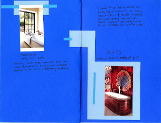
Anne Fontaine Spa, Paris
I absolutely LOVE this spa. It looks incredibly relaxing. The design is so modern and sleek. It looks very clean, which I would want and expect from a spa.
Guerrilla Restaurant, New York City
This restaurant was designed by the Rockwell Group. It looks very modern and it is kinda different for a restaurant. There is a big contrast between the white lights and the blue shapes hanging above them. I love the simplicity and cleanliness of the all white tables.
Vikkii Church, Helsinki, Finland
This is the most unique church I have ever seen. It was designed by JKMM Architects after they won a competition for the design of the building. I love how the entire church is made of beautiful woods, and the large window make if appear that you are outdoors, like in a pavilion.
Painted Staircase
This staircase it so cool! I have never seen anything like it. The vertical lines are really amazing to look at. I love the vibrant colors against the white walls. It makes them stand out that much more.
Chelsea Duplex Penthouse
This penthouse was designed by Paul Cha Architect. The whole area is very modern, and think it is a great use of space. I absolutely love the stairs and I want them in my house!
29 November 2007
Time Capsule in Orthogrphic View


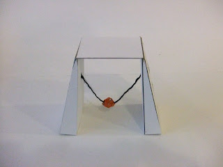
This is my orthographic drawing of my time capsule. The Top image is the top view, and the drawing below it is the view from the front. In the bottom image, the drawing on the right is the side view, and to the left is part of the frontal view. I left it there to help show the comparison of the dimensions.
28 November 2007
20 November 2007
Tiffany Posing
19 November 2007
15 November 2007
12 November 2007
07 November 2007
06 November 2007
[more] shading
01 November 2007
Shaded Objects
25 October 2007
Shading Techniques
22 October 2007
magaZINE
11 October 2007
META.MOR.PHO.SIS


In this project the objective was to create 3 intermediates between 2 projects other classmates had designed. I was to chose from Missy Wicker and Megan Schwartz's projects. The image on the bottom has thumbnails of several ideas for the middle model. The first image is of Missy's project. The second one is the mis between that project and the intermediate of the two original projects. The third image is the intermediate, incorporates characteristics of both of the projects, and is pretty equally weighted between the two. The next image has a mix of Megan's project and the middle model. The final model is of course Megan's model.
I really enjoyed this project. I like how we had to build off other ideas, but still come up with our own idea. I think it was my favorite so far!
Elephant Memory
This project was about creating a place to house a memory. My memory was of seeing a very interesting building in Bangkok, Thailand. I was driving by it, so i was very hard to see, and it was irritating. The building itself was very interesting. It was shaped like an elephant with trunk and ears included. I feel like my final product was successful, considering my thoughts of it before I completed the final product. I improved it a lot and now i really like it!


Subscribe to:
Comments (Atom)


